
? Explaining points and importance")
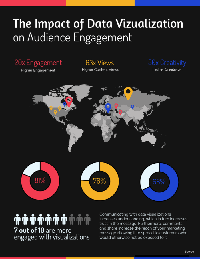
When creating presentation materials, websites, catalogs, leaflets, and other promotional materials, keeping data visualization in mind will make them more persuasive.
This time, we will introduce the importance of data visualization and the key points for creating materials that are easier to read and more persuasive.
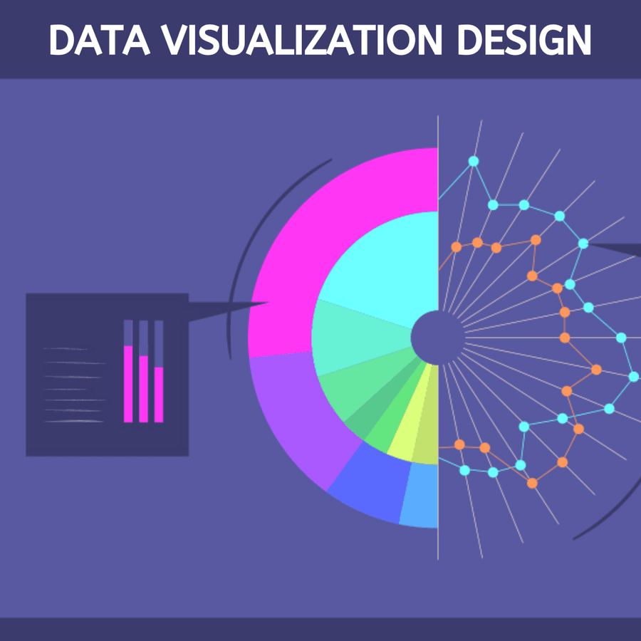
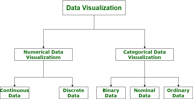
What is data visualization?
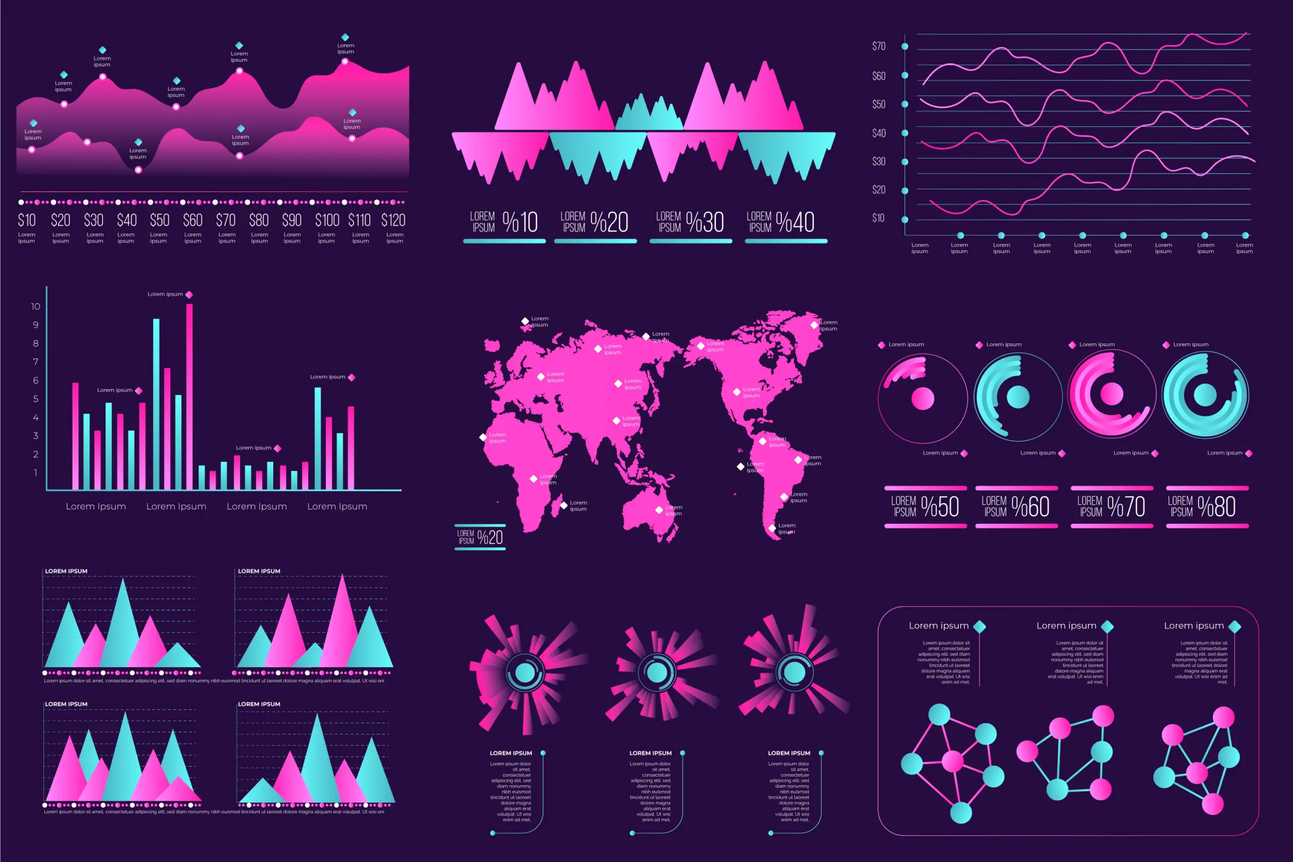
Data visualization is the process of visualizing a list of data such as numbers and characters using graphs, conceptual diagrams, and other diagrams to make it easier to understand visually.
How would you feel if you were shown a table like this? Many people may think, “I know the sales amount, but it’s hard to see.” For example, if you try to compare sales trends for each product, it may be difficult to get an idea from a list of numbers like this.
Therefore, I tried to create a data visualization of the sales list mentioned earlier using graphs. I think this makes it easier to understand the sales trends for each product.
For example, you will be able to analyze things like, “Product A sells consistently every month, although the sales amount is small,” or “Product D sold well in the first half of this year, but sales plummeted in the second half.”

Benefits of data visualization
By adopting a data visualization mindset, you can enjoy the following benefits:
You can read the numbers and trends, making it easier to analyze such as comparisons and future predictions.
For example, by using materials that utilize data visualization, you may be able to gain understanding from your superiors and pass internal approval. Improving your promotional materials to make them more visually appealing can increase customers’ purchase intent. That’s the power of data visualization.
Key points to increase persuasive power with data visualization
Even if you incorporate the idea of data visualization into your materials, if you are not using it effectively, it may become difficult to convey your intentions. Therefore, I would like to share with you some points that can improve your persuasiveness.
For example, a bar graph is suitable for comparing single months, but it is not so suitable for looking at sales trends over a year.

Line graphs make it easier to read numerical changes and trends.
In this way, let’s change the way we express ourselves depending on what we want to say.
For example, if you want to express the sales of product A, there is no need to include extra information such as products B and C. It gives a cluttered impression and is difficult to see.

Product A is sufficient for the data series in the graph. It is easier to see visually and has a greater impact.
For example, if you group polygon lines with the same color, it becomes difficult to tell which line belongs to which data. Since we are going to incorporate the idea of data visualization, let’s also pay attention to the appearance.
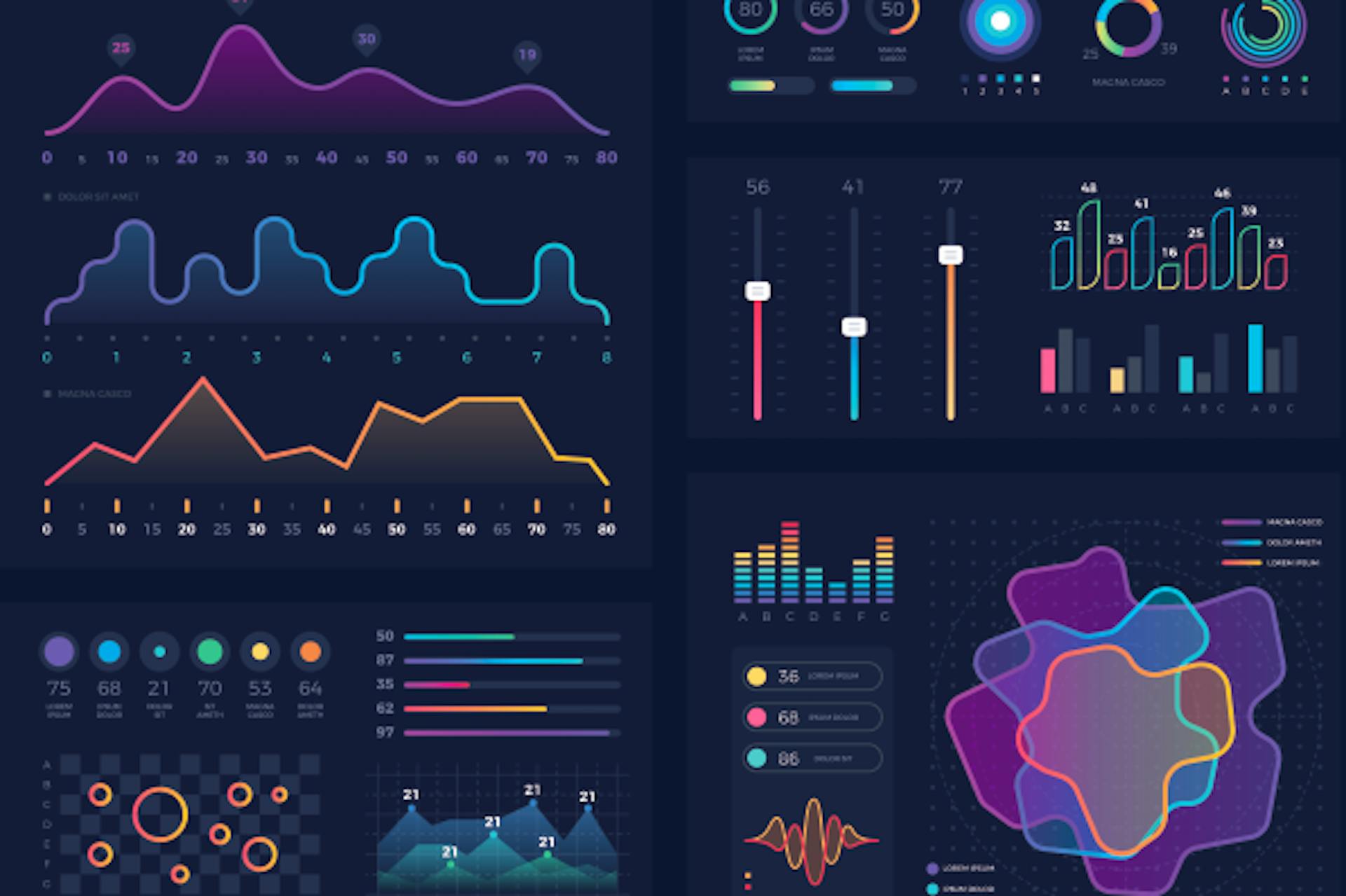
When it comes to color usage, there are techniques such as using colors that stand out for things you want to emphasize.
First, put yourself in the other person’s shoes and find out if the chart is easy to see objectively. Is it hard to see? Please review it. Then, try to come up with a way to clearly convey your intentions.

summary
◆Data visualization (information visualization) is the visual representation of data such as letters and numbers using graphs, conceptual diagrams, etc.
◆It has benefits such as increased persuasiveness, reduced mistakes, and improved accuracy of analysis.
◆ Data visualization may increase the possibility of passing approval and increasing sales.
◆By devising ways to express things and making them simple and easy to read, you will be able to express yourself more effectively.