On a BtoB site, a features page is a page that summarizes the benefits of a product or service, such as how it solves users’ problems, the strengths of the product or service, and the differences from other companies. It is often written in the title, such as the features of the service, its strengths, and the reason why it is chosen.
This time, we will introduce the points to consider when creating feature pages for BtoB sites, along with site examples from
SaaS
companies.
Role and necessity of features page
The features page is a page that introduces the strengths of a product or service. The home page comprehensively introduces products and services, but the features page provides information such as how the product solves users’ problems and issues, what its strengths are, and how it differs from competing products and services. I will introduce this thoroughly. It plays the role of telling users who visit the site how we are different from competitors and guiding them to CV such as downloading materials or making inquiries. Also, it is not always necessary to create a feature page for a BtoB site. If you can introduce the features of your product or service on the home page, there is no need to set up a features page. Alternatively, if you have multiple products/services, it may be better to introduce the features of each product/service on its own page.
Features page creation points [Top page]
On the labor management cloud SmartHR website, the top page introduces the features of the service as “3 Points of SmartHR.” Below the three points and distinctive features, there is a CTA that says “See more features of SmartHR” and redirects you to the features page.
SmartHR | No.1 market share cloud HR and labor software
On the website of Cloud Warehouse Management/Logistics Inventory Management System Logizard ONE, the features of the service are introduced as “The benefits of having the No. 1 cloud WMS in operation.” There is no feature page, but a text CTA that takes you to a page related to each point.
One way to transition to the features page is to display it in global
navigation
(Gronavi). Cloud POS Register On the SmaRegi website, when you hover over the “First-time users” section on Gronavi, a
pop-up
CTA such as “What are the features of cloud-based POS” and “Why choose SmaRegi” will be displayed.
Features page creation points [Features page]
We will introduce the points to consider when creating a features page.
①First view
First view is also important for feature pages. On the SANSAN business card management tool website, there is a CTA “Click here to download materials” on the first view of the features page. Along with the lead text, “Understanding SANSAN in 3 minutes,” the site directs users to download materials that will help them learn about the features of the service.
② Contents are in the order of issue → solution → case study → other
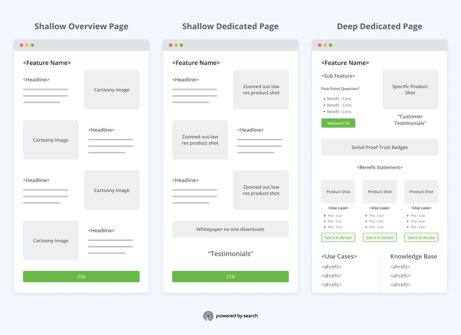
On the features page, companies tend to list points that they really want to emphasize, but it is important to appeal from the user’s perspective. Specifically, it is a good idea to develop the content in the following order: Issue → Solution → Case Study → Other. After the introduction example, we will explain the reasons for choosing it, the introduction process, QA, etc., and create a structure that can be completed on one page.
Cloud ERP freee is the same brand and provides a wide range of services such as accounting software and human resources and labor management software. Additionally, the site introduces different issues on different pages, depending on the size of the workforce, even though the software is the same.
On the page that introduces human resources and labor management software for companies with 20 or more employees, the first view has a catchphrase and CTAs for downloading materials and making inquiries. Below the first view, content is developed in the order of labor management issues, solutions to those issues, and implementation examples.
Early avoidance of mistakes and labor risks. Cloud ERP freee for human resources management | Cloud ERP
On the groupware desknet’s NEO website, the features page presents issues and solutions, as well as implementation examples and content. Specific company examples are displayed for solutions to each issue, making it easy to access implementation examples. In addition, after the introduction example, the reason for choosing it, the introduction flow, and QA are explained.
Furthermore, at the bottom of the page, there is a link for those who would like to learn more, which will take you to the next page that might interest you, such as seminar information and implementation examples. It is designed to increase navigation within the site and allow users to deepen their understanding of products and services.
About desknet’s NEO | Groupware desknet’s NEO
③Reason for being chosen
It is used to express the features of a product or service and is called “reason for choosing it.”
Website Multilingualization Solution The features page of the WOVN.io site features comments from companies about why they choose WOVN.io. It works in a carousel format, so if you hear about a company you’re interested in, you can go straight to that company’s implementation examples.
Features | Multilingualization and translation of the website is available at WOVN.io
Features page creation points [Others]
We will introduce the creation points other than the top page and feature page.
① Make it independent from the features page
When conveying the features of a product or service to users, if you cannot fully convey the information on the features page, or if you want to promote one feature on a single page, you can separate it from the features page and transition to it.
Continuous user usage is an important point in SaaS services, and many companies focus on user support. Organizational Improvement Cloud Motivation Cloud’s website uses a single page to promote support. We introduce the face photos and names of our consultants under “Support System by Consultants.” By posting a photo of your actual face, you can create a sense of security and trust among users.
②Convey the features of each usage scene and service
Features may differ depending on the user’s usage scene and the service used. In that case, it is appropriate to introduce the features on the “Usage Scenarios” and “Service” pages, rather than grouping them together on the Features page.
Talent management system Kaonavi’s website summarizes the features for each “usage scene”.
Unification and visualization of human resources information | Usage scenarios | Kaonavi [No. 1 share] Talent management system that discovers employee individuality and talent and accelerates strategic human resources
summary
- Features pages are pages that introduce the strengths of products and services. It plays the role of conveying to users who visit the site the difference from competitors and guiding them to CV such as downloading materials or making inquiries.
- For conductor design from the top page, introduce an overview of the features such as “3 points” and then set up a CTA below that says “See more features” and transition to the feature page, or go to the related page for each point. Set up a transitional text CTA
- First view is also important for feature pages. Set up a CTA “Click here to download materials” on the first view to guide users to download materials where they can learn about the features of the service.
- On the features page, it is best to develop the content in the following order: Issues → Solutions → Examples → Other. After the implementation example, explain the reason for choosing it, the implementation flow, QA, etc., and make it a one-page structure.


![Figure: Features page creation points [Top page]_01](https://blog-static.userpilot.com/blog/wp-content/uploads/2023/03/20-best-saas-landing-pages-and-why-they-convert-so-well_9bb3b0415047b3dc57df8446ced572df_2000.png)
![Figure: Features page creation points [Top page]_02](https://www.vecosys.com/wp-content/uploads/2016/12/saas-development.jpg)
![Figure: Features page creation points [Top page]_03](https://www.andava.com/wp-content/uploads/2020/03/so.png)
![Figure: Features page creation points [Top page]_04](https://ugem-production.s3.amazonaws.com/uploads/articleimage/file/70/969515827d_2x.png)

