

It is extremely important to design your web pages and services so that users can easily view them and use them intuitively, no matter what device they use. Material design is a new design method established by Google to improve user convenience.
Material design incorporates the physical laws of the real world into web screens, allowing users to operate intuitively. This time, we will introduce the advantages, disadvantages, and detailed rules of material design.
What is Google recommended material design?
Material Design is a new design method that Google announced at a conference in 2014. With the spread of various types of devices such as PCs, smartphones, and tablets, our aim is to create web pages and services that are easy to view and can be operated intuitively on any device.
Material means something physical or tangible in English. Material design has strict common rules that incorporate the physical laws of the real world.
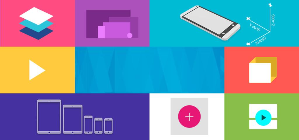
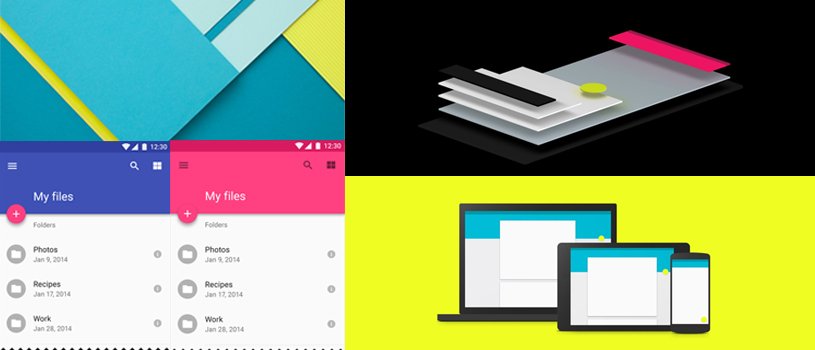
The basic concept is to consider a web screen to exist in three dimensions, with paper and ink as its constituent elements. Specifically, we emphasize visual effects that comply with the laws of physics, such as depicting shadows and making them appear three-dimensional.
・Paper rules
In the real world, shadows are created when multiple sheets of paper are stacked and suspended. Expressed on the web, for example, if one column (frame) has a shadow, it can be perceived as having a height. Buttons and icons on the web are also considered paper elements.
The shape of the paper is square or circle, the thickness is 1dpi, and the size can be changed freely.

・Ink rules
On the paper there are ink elements such as colors, photographs and illustrations, text and videos. The ink can be moved within the confines of the paper. There is no concept of thickness.
Advantages and disadvantages of material design
Adopting material design has the advantage of improving user convenience and creating highly complete designs in a short time, but has the disadvantage of making it difficult to differentiate designs.
【merit】
・Achieving intuitive operability and improving convenience
Since it is configured with a unified design as described above, sites and services that users visit for the first time can be operated intuitively, increasing convenience. will improve.
・Highly complete design in a short time
Since the design is created according to pre-set rules, it is possible to create a highly complete design in a short time.
[Disadvantages]
・Difficult to differentiate by design
Since design rules are unified, it becomes difficult to differentiate by design.
Material design rules
In addition to the components of paper and ink, we will introduce the rules of material design.
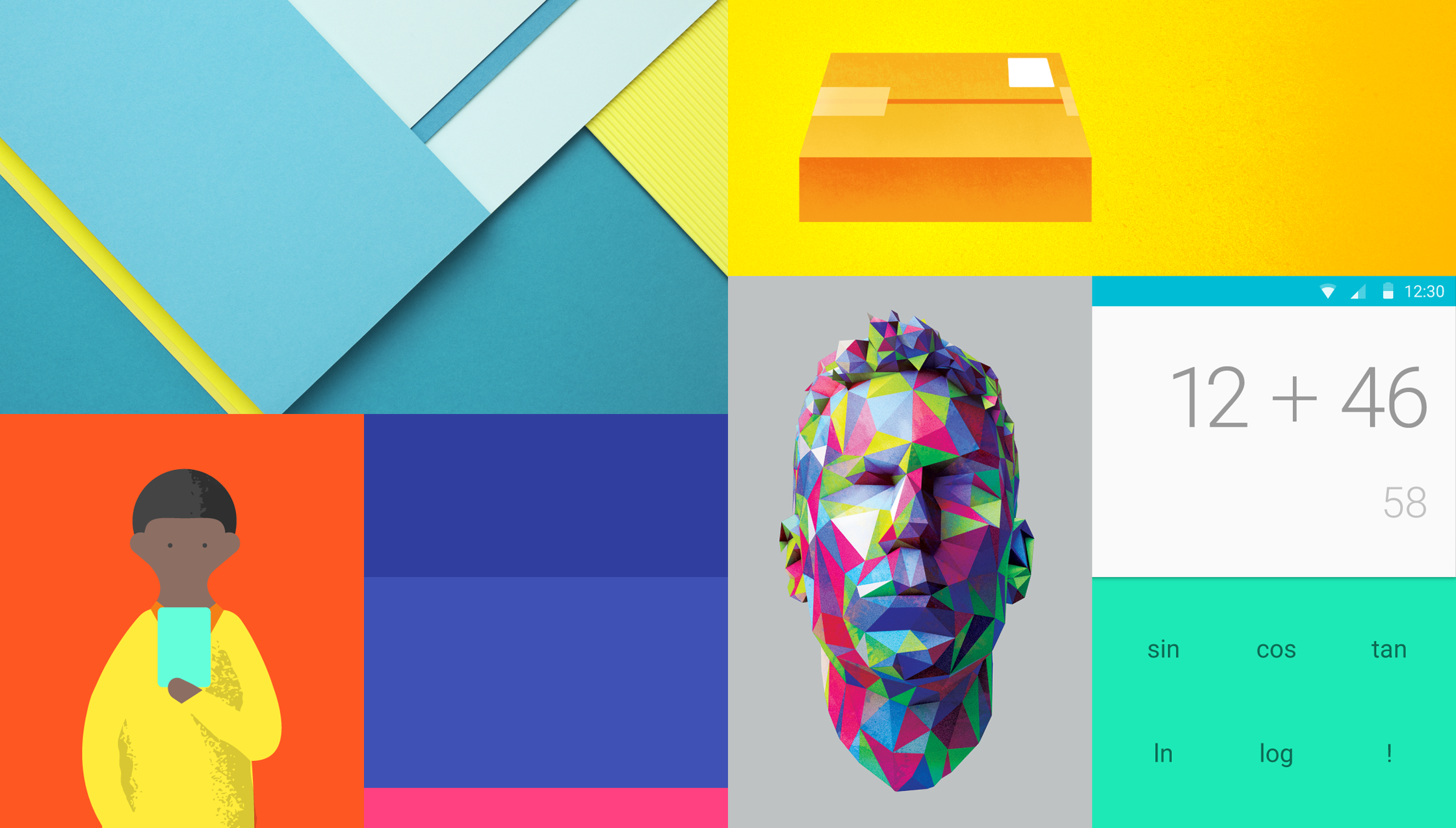
・Number of colors and color scheme
Material design limits the number of colors to four chromatic colors. Each of the four colors has its own role.
①Main color The main color of the web screen (only one color)
②Subcolor Colors that support the main color/colors similar to the main color (up to 2 colors)
③Accent color: Color used for areas you want to stand out.・Color that is different from ① and ② (only one color)
In addition to the four colors ① to ③, you can freely use achromatic colors such as white, black, and gray.
At the site below, you can choose a color scheme suitable for Material Design.
Material Design Colors, Material Colors, Color Palette
・Three-dimensional depiction using shadows
We will use shadows to create a three-dimensional effect on the screen. We will add shadows according to the physical laws of the real world. The purpose is to help students recognize how each element overlaps, just as it was in the paper rules.
・Animation according to user operations
Use animations that respond to user interactions. Animation is not just a decoration; its purpose is to support the user’s understanding by showing the impact of the user’s operations, as shown below.
① Can determine whether the action was successful ② Shows which item is selected ③ Shows that the content is loading ④ Gives a hint to the user about what operations are possible
The demo video published by Google includes a wealth of motions during operation. In the video, the response when the user taps or swipes is clearly expressed.
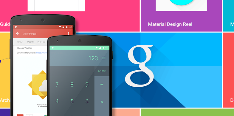
Material design
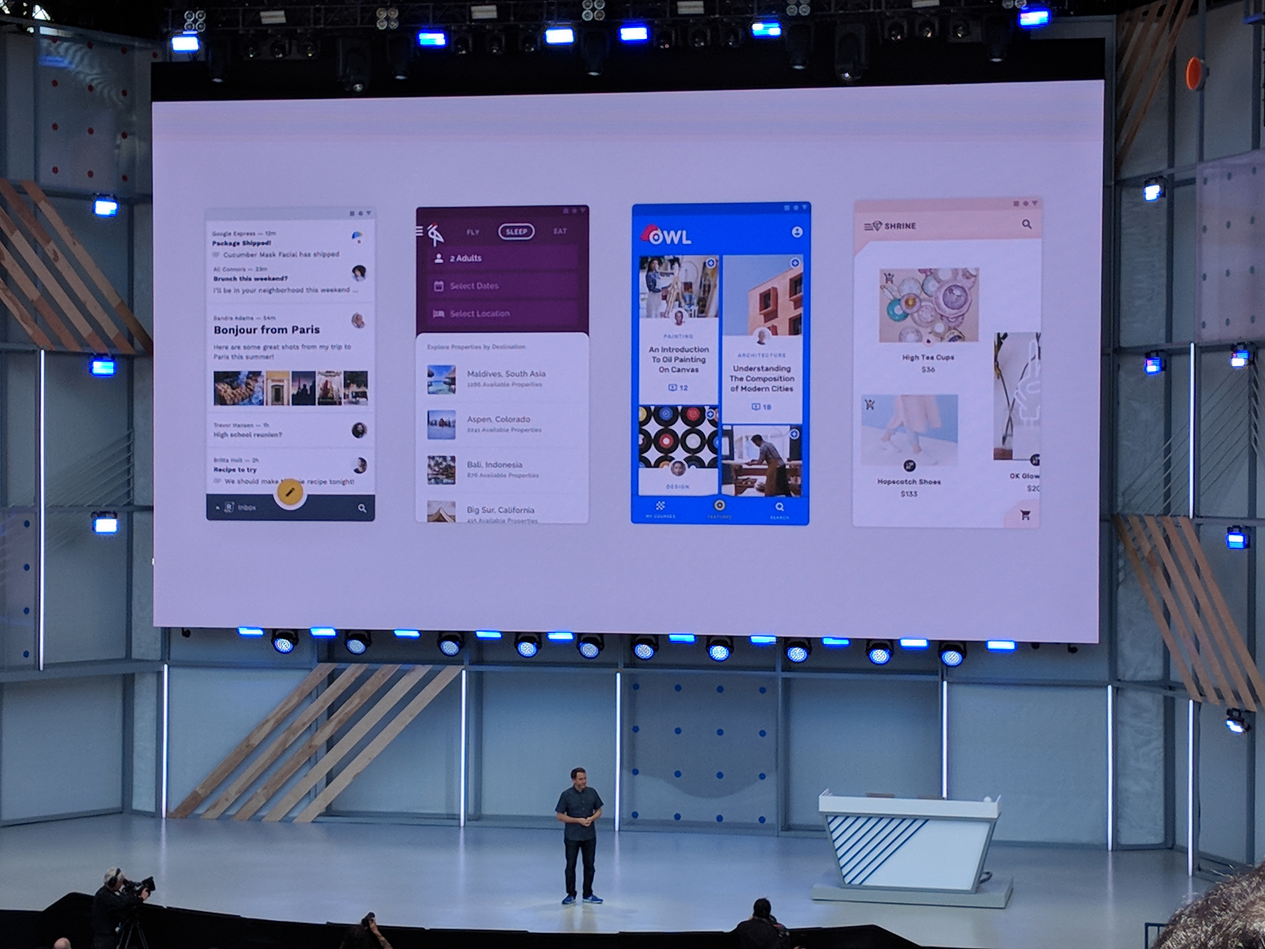
Website creation that utilizes material design
·button
In Material Design, buttons are divided into four types based on the importance of the action.
①Text button A design expressed with colored text. Used for less important or negative actions ② Act line button Flat design with no background color or shadow. ③Contained button used for less important actions
A design that appears to stand out slightly from the web screen. ④ Toggle button used for somewhat important actions A button that groups a series of actions using layout and spacing. Used less frequently than other button types
Source:
https://material.io/components/buttons#usage
There are other buttons as below.
⓪Floating action button
Buttons used for the most important actions on a web screen. Basically, add a shadow in a round shape and write an icon to indicate the meaning inside the button.
·icon
There is a Material Icon provided by Google that you can use for free. You can install it by simply putting code in the HTML header, and you can freely change the color and size.
Material Icons by Google
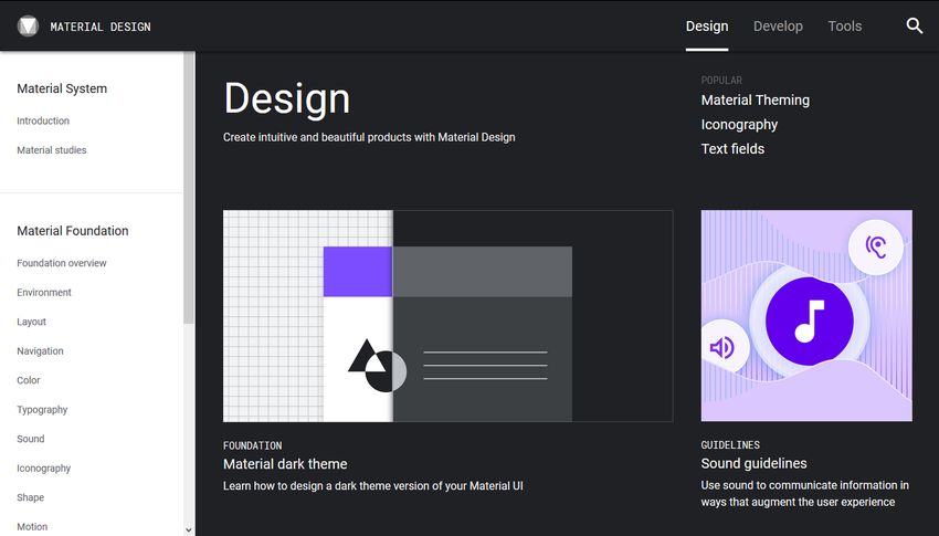
・Framework
You can easily incorporate Material Design by using the Material Design framework provided by Google.
Material Design Lite

Examples of material design
Examples of material design include Google’s various service pages. If you look at it while keeping in mind the rules I’ve introduced so far, you’ll see that Material Design is incorporated throughout the web screen.
-
Google Map
Google Maps -
Google play
https://play.google.com/store/
-
Think with Google
Think with Google Japan

summary
- Material design is a new design method announced by Google that incorporates the physical laws of the real world, and its purpose is to create web pages and services that are easy to view and intuitive to operate on any device.
- The advantage of using material design is that it not only makes it possible for users to intuitively operate sites and services that they visit for the first time, improving convenience, but also allows users to create highly complete designs in a short amount of time.
- According to the rules of Material Design, the number of colors is up to four chromatic colors, and each color has a role as a main color, sub color, and accent color.
- In Material Design, buttons are divided into five types based on the importance of the action: text buttons, act line buttons, contained buttons, toggle buttons, and floating action buttons.