Improving
rate is a website improvement measure that can be directly linked to results, and if you can make a major improvement, it can have a great impact as a measure. Additionally, you can gain results by working on improving CTAs that direct users visiting your site to inquiry forms and document download forms.
This time, we will introduce how to improve conversion rates by designing and reviewing CTA. We also recommend the following columns to improve your conversion rate.
Have a long-term perspective with appropriate conversion measures | MarketTRUNK
How to improve your CV? The importance of funnel strategy/conversion rate optimization (CRO measures) based on customer insights | MarketTRUNK
When conversion and CVR are sluggish, it’s time to go back to basics | MarkeTRUNK
CTAs and conversion rates
CTA is an abbreviation for Call To Action, which means something that invites action. It refers to guiding users who visit a website to take a specific action, or its elements. CTAs that are directly linked to conversion are those that prompt users to transition to an inquiry form or a document request form.
Conversion rate is calculated as number of conversions/number of sessions (number of visits). They visit a website, reach an inquiry form or information request form, complete the form entry, and convert.
Visit website → reach each form → complete form entry
CTAs will improve the reach of each form from your website visit. EFO (Entry Form Optimization) is the process from arriving at the form to completing the form, and by working on it at the same time as improving the CTA, you can expect to improve the conversion rate.
What is the optimal EFO for BtoB sites? | MarketTRUNK

Key points for CTA design/review ① CTA installation location
We will introduce points to improve conversion rates from CTA design or review. First, consider and confirm the location of the CTA. The following three locations are required for CTA installation.

① First view of each page
Wacul research shows that more than half of all conversions occur directly from the entry page to the form.
By always placing a CTA on the first view of each page, users who visit with the purpose of making inquiries, requesting information, etc. can easily reach the desired form without getting lost.
Websites are skimmed. User behavior research on B2B service sites and EC|WACUL TECHNOLOGY & MARKETING LAB

②Global
navigation
(Gronavi)
Setting up a CTA on Gronavi is useful not only for users who visit the website with the purpose of making inquiries or requesting materials, but also for users who have navigated the site and want to know more detailed information, and when making inquiries or requesting materials. You can easily access the form without getting lost.

③End of content
In the case of SEO content or case study content, you can guide users to the form by placing a CTA at the end of the content. By creating text that matches the context of each piece of content, you can expect to improve the reach rate of your forms.
In addition, it would be effective to install it in a location that is easily visible and follows the flow of the user’s line of sight.
Points for CTA design/review ② CTA design
After considering and confirming the installation location, it is time to design the CTA. There are three types of CTA designs. We will consider what format is appropriate for each page depending on where it will be installed.

① Button format
This button format is the most common. It is mainly suitable for CTA placed in Gronavi, footer, and first view.
If you place a CTA that transitions to another page in the form of a button, make it more prominent than other buttons. It would be a good idea to use a background color for the inquiry and document request buttons to make them stand out, and to create a design that makes them stand out slightly from the web screen.

②Banner format
Create and place a banner like a banner ad. Place it on the side of the page and follow it, or place it at the end of the content page. Guide users to the form by inserting text that prompts them to make inquiries or request materials, as well as illustrations and images of materials that can be intuitively visualized.

③Text format
Suitable for placing a CTA in the middle of an article, such as SEO content or case study content. Since it is displayed as text, it is easy to see it as part of the article, and it is possible to guide users to the form without compromising usability.

Key points for CTA design/review ③CTA lead text
Once you have decided on the CTA design, it’s time to consider the text. There are three points to consider when creating text.
① Image the destination page
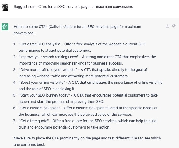
The key is to be able to imagine what kind of page the CTA will lead to. It is also effective to use text that grabs the user’s interest by showing an overview or part of the page’s content, such as “Inquiry for more information” or “Learn more from the materials.”
② User benefits
It is also important to present the benefits to users when they go to the destination page. By presenting the benefits to the user in accordance with the context of each page, such as “We will introduce the services introduced by this company” on the introduction case page and “We will quote a detailed pricing plan” on the pricing page, This makes it easier to guide the flow in a more natural manner.
③ Induce “now” action
By using text that is limited to a limited time, such as “If you open an account this month, the first month’s fee is free,” or “Limited to 10 companies! Free trial,” you can give users a sense of urgency to take action right away. Masu.
You can also encourage them to take action now with text like “Request information now.”
Points to note when installing a CTA
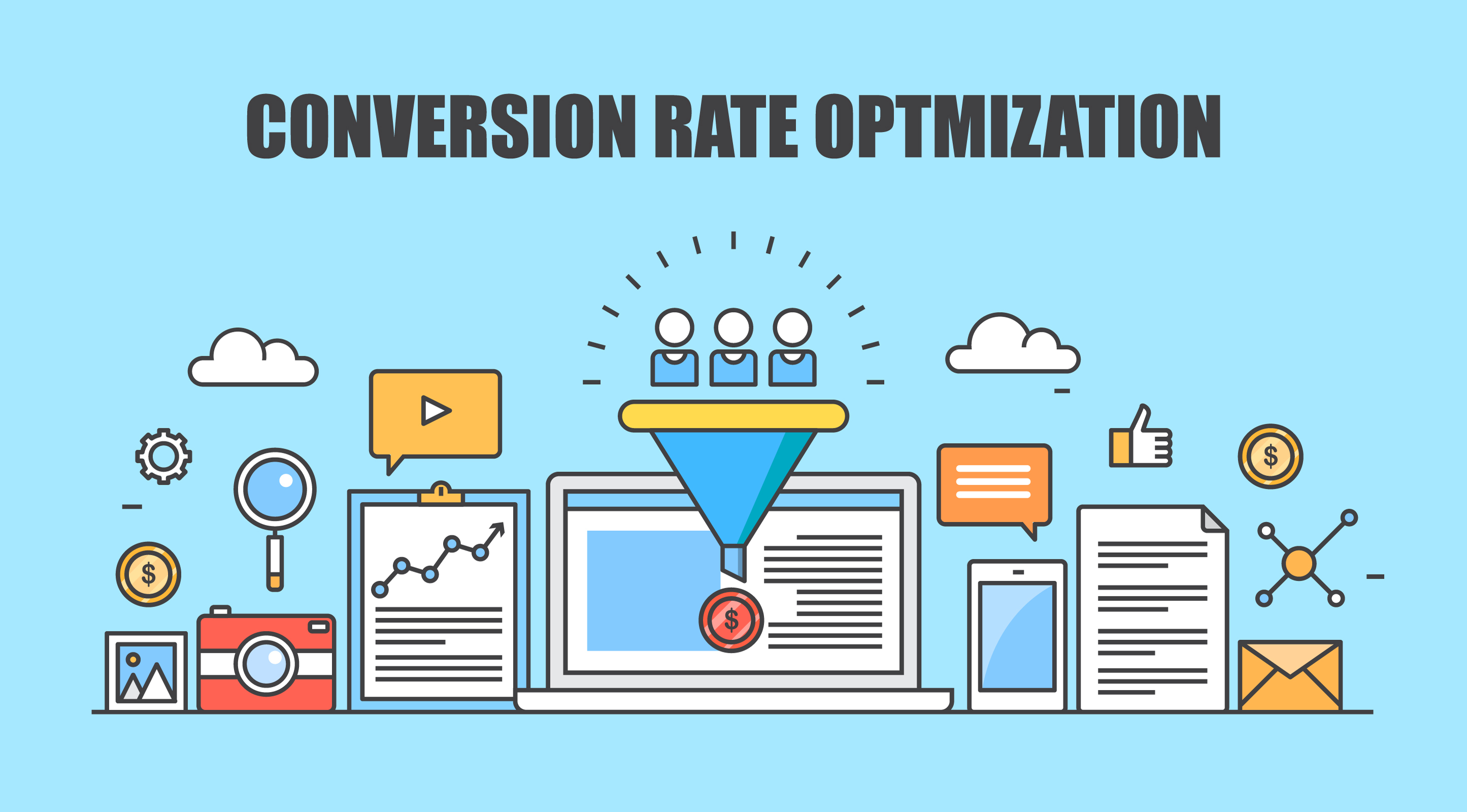
If you increase the number of CV types and CTAs in order to increase conversions, users will be confused. Users are unable to achieve their goals on the website and leave the site, resulting in lower conversion rates.
When installing and reviewing CTAs, we regularly monitor the reach rate from each page to the form and the number of clicks for each CTA, and repeat analysis and improvements to improve conversion rates.

summary
- CTA improves the reach of each form from a website visit. From the arrival of the form to the completion of input becomes EFO, and by working on it at the same time as improving the CTA, you can expect to improve the conversion rate.
- The first view of each page, global navigation, and end of content are required for the CTA location.
- There are three types of CTA designs: button format, banner format, and text format. We will consider what format is appropriate for each page depending on where it will be installed.
- When creating text, the key is to make it easy to imagine what kind of page the CTA will transition to and what benefits it will bring to the user.

