

When displaying a web page, it must be suitable for each device such as a smartphone, tablet, or PC. This is because depending on the device, ads may be difficult to view, and users may end up going to other companies’ sites.
In order to effectively deliver advertisements for products and services to consumers, it is important to take measures to ensure that both users who access your website from a PC and those who access from a smartphone can view it appropriately. . Nowadays, Google recommends responsive web design, and it is necessary to take measures to make your website appear at the top of search results.
In this article, we will explain the overview, types, and implementation methods of responsive web design that can solve the above problems.
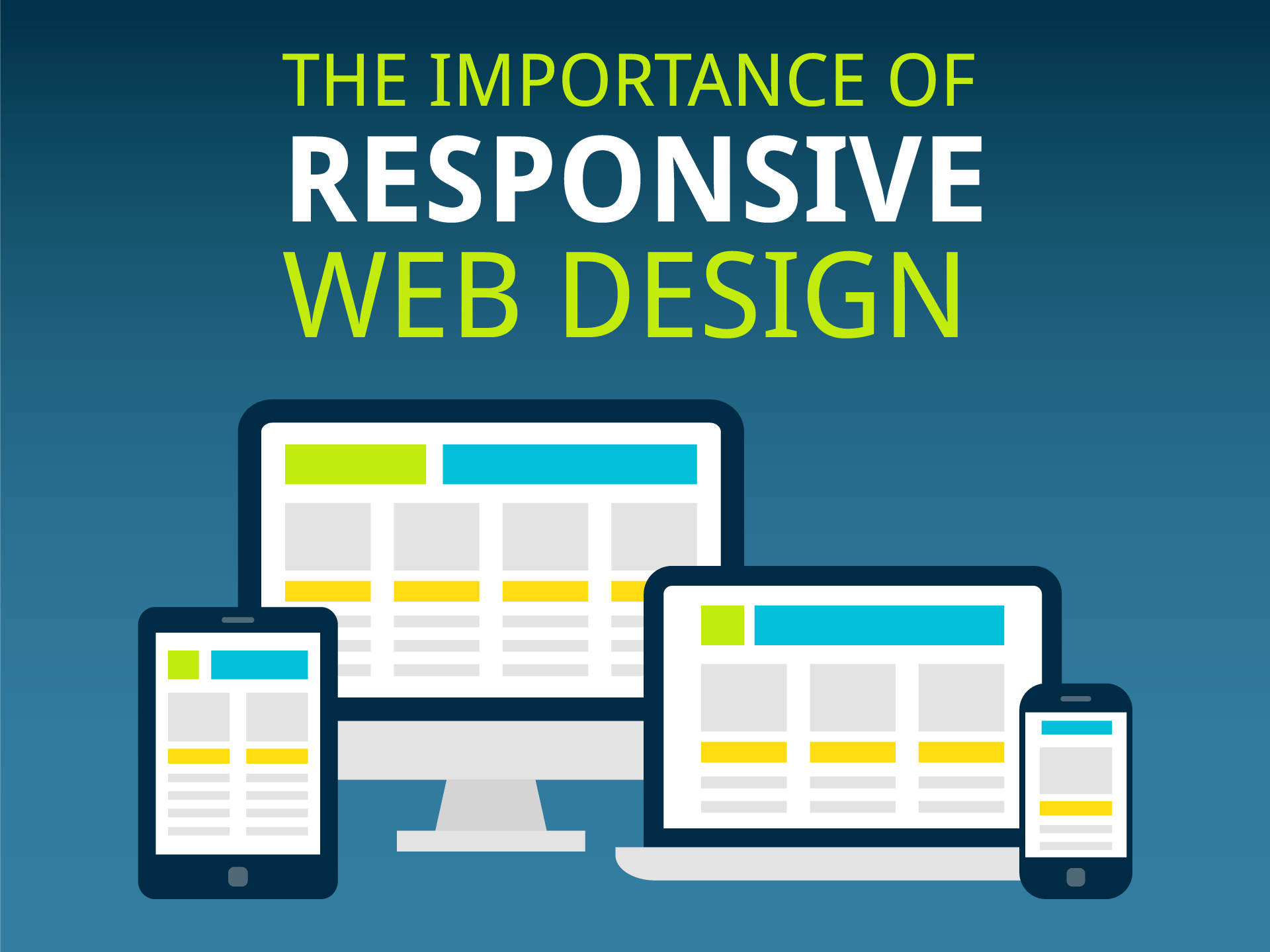
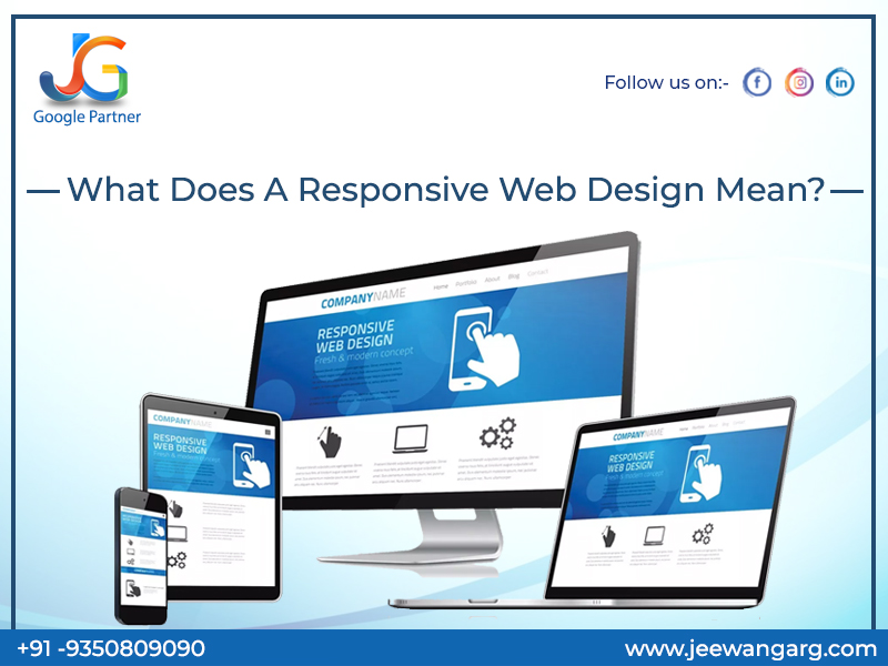
What is responsive web design?
Responsive
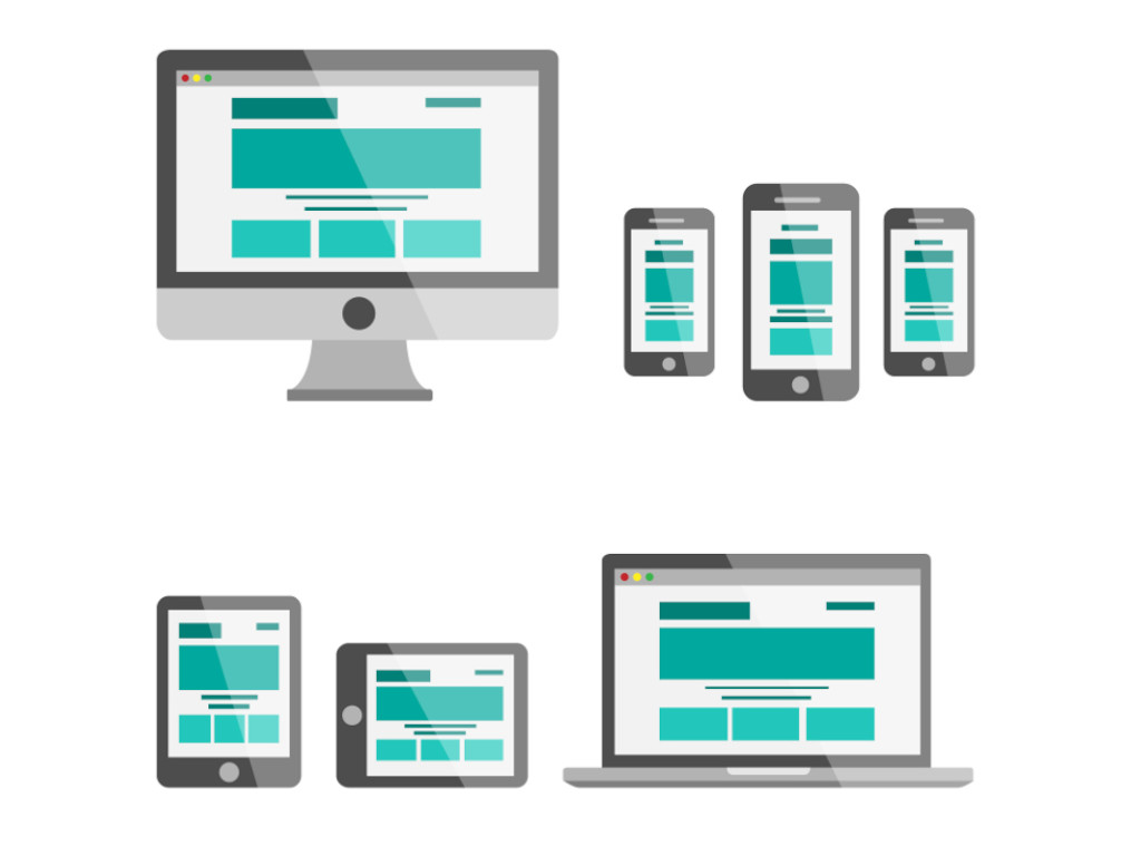
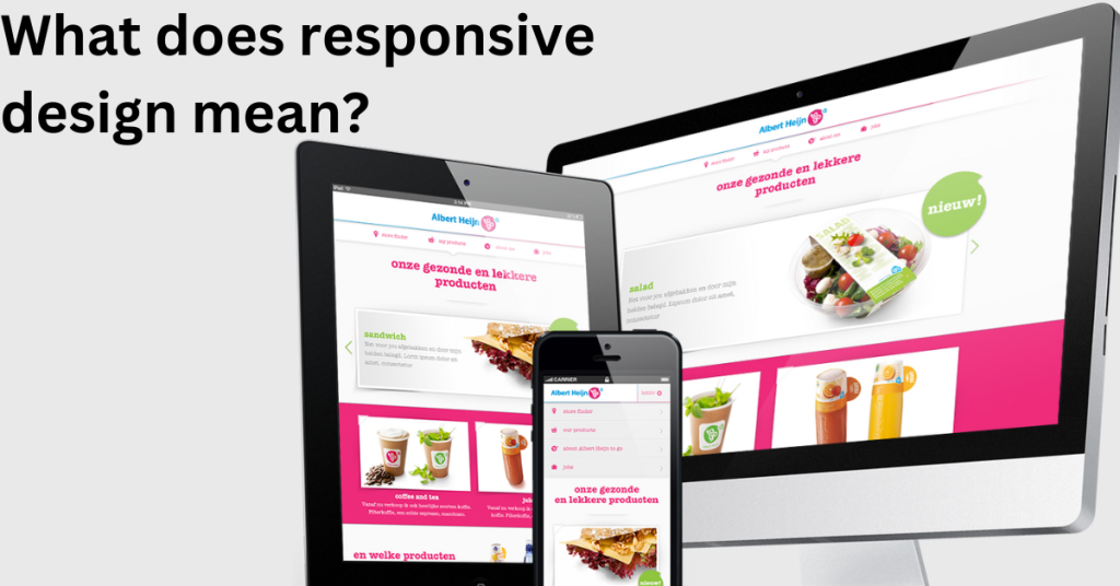
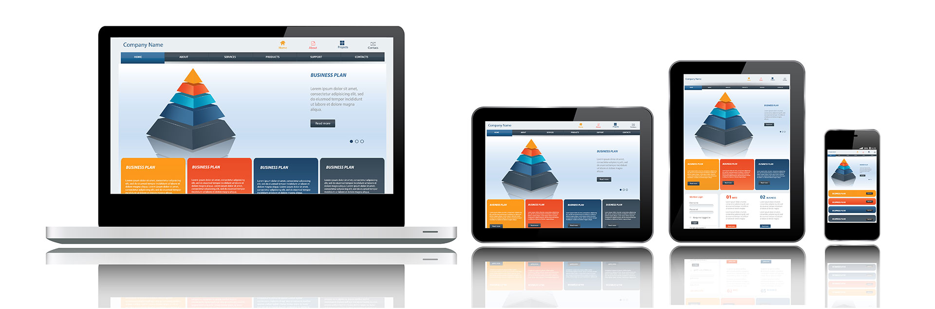
web design refers to flexibly adjusting website display based on the width of different screen sizes, such as smartphones, tablets, and PCs, to make it easier to view. The advantage of responsive web design is that the same file can be displayed on all devices.
In addition, common elements such as text and images are used for homepages, making it possible to centralize and manage files when updating or modifying them. Furthermore, as Google recommends responsive web design, it is expected that responsive web design will become even more important in the future.
Related article:
What is homepage responsiveness that even beginners can understand?
Types of responsive web design
So, how exactly can you make your company’s homepage look like with responsive web design? Here, we will introduce three types of responsive web design layouts: responsive, liquid, and flexible.

responsive
A responsive layout is a layout that changes
CSS
depending on the width of the screen.
The number of pixels at which CSS changes is called a “breakpoint,” and by specifying the value of this breakpoint, you can create a display that is appropriate for the user’s device.
liquid
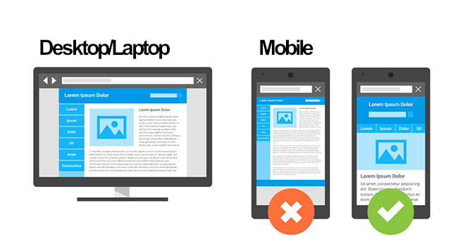
Next, a liquid layout is a layout in which the width of the entire site changes depending on the screen width of the device on which it is viewed. For example, when viewing a website created on a PC on a smartphone, many people may have experienced the annoyance of not being able to see the entire site and having to scroll horizontally over and over again.
Since Liquid Layout specifies the units of each element using percentages, it has the advantage of making your site easy to view on any device.
flexible
The last flexible layout we will introduce is similar to the liquid layout, which displays the units of each element as a percentage. However, flexible layouts additionally allow you to set the maximum and minimum width of the screen.
When displayed on a device larger than the preset maximum width, there is a function that creates margins on the outside to improve the appearance. Therefore, if you want to fix only the layout when displayed on a PC, this flexible layout is ideal.
Benefits of responsive web design
Responsive design has benefits from every perspective: business operators who operate websites, consumers who purchase products and services, and search engines.
We will explain the benefits of each in turn.
①Ease of site management
Responsive design allows publishers to manage a single
HTML
file and make their site visible on any device. This means that you can reduce the amount of time you spend managing your site.
Therefore, you can reduce business costs such as site management personnel costs. As a result, you may be able to use the reduced costs to fund your customer acquisition budget or set aside a budget for investing in new businesses.
②Advantageous for SEO
In modern society where smartphones are rapidly becoming popular, there is a growing need for businesses to make their web pages compatible with smartphones. Search engines such as Google are also working to prioritize mobile-friendly sites.
This point is even specified in Google’s official guidelines, so you can see how important responsive web design is for
SEO
.
Content has become so important these days that it is said that “content is king,” but it is important to carefully examine the design aspect so that it will be evaluated by search engines.
③Easy to share on SNS
Responsive sites display a single URL regardless of the device used, making it easier for consumers to share web pages on social media. Additionally, a viral site can be viewed on any device, increasing virality compared to non-responsive URLs.
Disadvantages and precautions of responsive
So far, we have explained the benefits of responsive web design. Here, we will explain the disadvantages of responsive design and points to be aware of.
① Design limitations and ease of collapse
Responsive design uses the same HTML on all devices, so you can’t change the layout drastically. Therefore, since it must be compatible with a wide range of devices, the design and font types must be versatile.
Also, if you don’t have enough knowledge of web design, the layout may look broken on smartphones and tablets. Therefore, if the design is too elaborate, there is a possibility that some devices will not be able to display the site.
Therefore, when creating a responsive site, it is important to create a design that is as concise and versatile as possible.
②Coding time required
Responsive sites need to be designed and coded for each device. Once the coding is complete, there is only one file to manage, which reduces management costs. However, implementing multiple pattern designs requires a lot of coding effort.
If you are a business that is starting to use responsive design, estimating the designer’s working time will help prevent misunderstandings about costs and sales.
③ Risk of display delay of smartphone page
A responsive site is characterized by having only one piece of HTML. Therefore, while site management does not require much effort, since the same data is loaded on both the PC and smartphone, it often tries to load data that is not displayed on the smartphone site (in other words, unnecessary data), resulting in a slowdown of the site display speed.
In fact, data shows that if a website’s display speed is reduced by 3 seconds, the user abandonment rate increases by approximately 50%. Therefore, when creating a responsive site, it is important to consider that all devices read the same data and be careful not to pack in too much data.

How to implement responsive web design
Here we will show you how to create a responsive website. Many people may find it difficult to understand, but it is actually very simple and can be implemented in the following two steps.
We will explain each step in turn.

Add meta viewport tag
First, add the meta viewport tag. For websites created using HTML files, it is necessary to add this to the header of all HTML files. On the other hand, if it is a website created with WordPress, there is no problem in adding it to a common template file.
By adding the above tag, you will be able to read the screen size of the device used by site visitors. Then step 2 below will give you specific instructions.

Specified in CSS file
Use media queries to specify responsiveness with CSS. With this method, you can switch the application of CSS depending on the screen size, so you can change the display and layout on PC and smartphone.

Summary: Responsive web design is essential for search engine optimization!
As mentioned at the beginning, search engines are now recommending responsive web design, and in order to display your website at the top of search results and make your products and services known to more consumers. , you can’t avoid responsive web design.
Strengthen your SEO by effectively incorporating responsive web design by understanding the advantages and disadvantages introduced in this article.